Foundations
Design thinking process
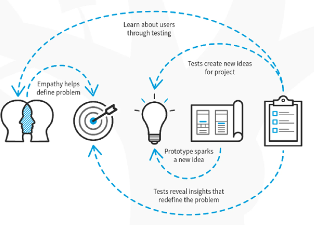
The Design thinking process is an iterative methodology used to understand what users want to achieve using a digital product and the pain points they might encounter along the way. Understanding and following this process in the early stages of developing or updating a digital service is crucial to create a good user experience. Following a methodology might seem like a hassle initially, but it reduces the risk of rework when the process is done. The design thinking process involves five phases. Empathize, Define, Prototype, Ideate, and Test.
To read more about design thinking, enter the following link:
https://www.interaction-design.org/literature/topics/design-thinking
Here is a short video summary with practical examples:
https://www.youtube.com/watch?v=_r0VX-aU_T8
1. Empathize- Research your users' needs

Since designing for the user experience is about addressing your user's pain points, you most first answer the question: What's their problem? What issue are you trying to solve for your user? And why are you the one with the answers?
- Write down your assumptions.
- Identify the problem
- Clarify what you are trying to achieve
- Consult experts in the area of concern
2. Define
In the define stage, you will organize the information you have gathered during the Empathize stage.
Gather all the insights to make sense of the landscape of solutions you are exploring. What themes are bubbling to the surface?
Your user research is going to baths lifeblood of your project. The things you discover and unearth during this stage lays the foundation for how your entire project will turn out. The most dangerous thing people do here is not to challenge their assumptions. Good user re.arch challenges all your assumptions.
That means doing things like:
Interviews User/focus groups Surveys Usability testing
After you know that this project aligns with your core mission and you know what questions you're trying to solve, you can start with the next phase.
Here are examples of core missions
- Updating your web application
- Creating a version of your digital service
- Adding a feature/extension to your application
3. Ideate - Challenge assumptions and create ideas
You can start developing potential solutions with a clear understanding of your users and a well-articulated challenge to solve. Before we start designing, we must align on the challenges/opportunities in the given landscape.
There are many ideation techniques you can use. Here are some examples:
- Brainstorm
- Brainwriting
- "Worst possible Idea^
- SCAMPER
- Mind-mapping
4. Prototype - Start to create solutions
This stage is all about experimentation. You are transforming all the information from the previous step into tangible artifacts. Now, it's time actually to build out your design. Here you have to design and validate it while constantly iterating based on user testing. That means building things like:
- Site map
- User flow
- Mockups
- Low-High fidelity prototypes
5. Test - Try your solutions out
After designing and redesigning until you go cross-eyed, find a way to test fast a. organically with your target audience if this is possible. Questions to ask should be open-ended and solutions-focused, such as, "What problem could this solve for you?", "How could this solution impact your experience?" and "What might make it an even better solution?"
That means doing things like:
- User testing
- Beta launch
- Internal testing
System feedback
A system should always keep its users informed about what's going on. The way we communicate system status is very important and it must be adapted to:
We have 4 different ways of communicating the system status to the user and understanding when and how to use these different types of feedback is important in order to communicate in a consistent manner to our users.
1. Indicators
Use indicators when the change:
- was triggered by an user action
- you don't want the user to respond
- it is specific to one Ul Element
2. Validation
Use validation when the change:
- was triggered by a user action
- you want the user to respond
- it is specific to one element
This mostly occur in forms, check out the form validation UI guideline.
3. Error Messages
Use error messages when the change:
- was triggered by a user action but you can't blame the user for it
- You want the user to respond
- it is specific to one element
4. Notifications
Notifications are a way of displaying information to the user that isn't directly related to a user action. Notifications can be both contextual ( related to one UI Element ) or global (related to general occurrences to the whole system). Example of when to use notifications:
- An analysis that was running in the background is completed.
- Your risk analysis was rejected by a colleague.
- You have 2 risk assessments that you need to approve.
- A new release is coming up.
The visible impact should be more than an indicator and also allow the user to continue its work by taking no action, e.g:
- Toaster
- Label or Badge
Data, time and numbers
Date and time guidelines
- Date and time should always be displayed in the users locale. NB! The different cultures also have different separators (E.g. "/", "-" or ".").
- Numeric formats can often cause confusion as different countries have different orders for the day, month and year so always use a written format if space is not critical.
- If you display the date in a numeric format, have a tooltip with the written format.
- Display date and time information as you do in daily speech, e.g. yesterday and tomorrow.
- If the day is in the upcoming week, also display the name of the day E.g. Tuesday.
Example Written formats 10th November 2016 or 10 November 2016 (UK) March 14th, 2016 (American) 10. nov. 2016 (Norwegian)
Time
To display time use colon as a separator between hours, minutes, seconds and milliseconds.
08:53:02
Numbers
The general rule is to use 2 decimals. If relevant to the context, the number with all the decimals can also be placed in a tooltip.
Infographics
Infographics (information graphics) is the display of information in such a way that it can be easily understood at a glance.
What makes a good infographic?
A great infographic will follow these principles:
Informative
- Be informative, accurate and reveal the story in the information.
- Add value to info graphics, presenting what text alone can't communicate.
- Bring clarity and understanding where there is complexity and confusion.
Engaging
- Create a visually stimulating and engaging experience that will capture the viewers attention and be something they'll want to spend time reading.
Accessible
- Aim to reach all audiences by communicating with the clearest language and the simplest techniques.
- Remove unnecessary visual clutter to create a clear and simple experience.
- Avoid communicating with colour alone.
Data visualisation
Data visualization is the presentation of data in a graphical format.
Assigning colour to data
What o the nature of the data you are representing?
Sequential
Best suited to ordered data that progress from low to high

DO Use clear lightness steps to give order to the data. Use light colors for low data values to dark colors for high data values.
Diverging
Used to emphasise data progressions from a critical midpoint of the data range.

DO Put equal emphasis on mid-range critical values and extremes at both ends of the data range. The critical midpoint class is emphasized with light colours and low and high extremes are emphasized with dark colors that have contrasting hues. DON'T Use colour alone to communicate your data.
Qualitative
Best suited to representing nominal or categorical data.

DO Use hues to create the primary visual differences between classes.
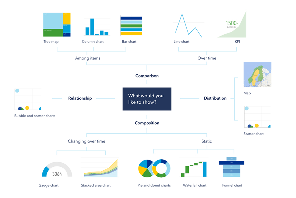
Choosing the right visualisation
Using the right visualisation will help tell the story in your data.

Legal
Copyright text
DNV AS is the legal entity for Norway. DNV AS shall be used in applications and documentation. All DNV documentation, reports, applications and any other works of authorship issued, produced or made by DNV to which DNV has full ownership shall contain a copyright notice as follows:
© DNV AS. All rights reserved
GDPR/Handling personal data
Engaging
GDPR has the potential to improve the user experience of our digital products and solutions by guiding the design towards clear and transparent communication. General Data Protection Regulation (GDPR) came into force in May 2018. GDPR demands clarity around how personal information and metadata is stored and used. New stricter rules for consent have also been implemented along with the requirements to move and delete data. Follow the guidelines below to be compliant with GDPR.
Guidelines
- Privacy should always be the default option. - E.g. checkboxes should not be checked by default.
- Never store personal data if it is not necessary. - Always have a clear goal for the data.
- When storing personal information you should always tell the user why we need it and what we are going to do with it.
- If possible, our product and solutions should be possible to use without asking for consent.
- Never store personal data longer than necessary.
When to ask for consent
You need consent for:
- Geo-positioning
- Marketing from partners
- Sending e-mails, post and SMS
- Software testing
- Profiling of customers
- Analysis of customers (e.g. web analytical tools)
- Re-targeting on Facebook.
Remember
Opt-in When asking for consent this should always be done in the context and in a clear no legal language Opt-out If you are asking for consent.
Sizes and States
Component sizing
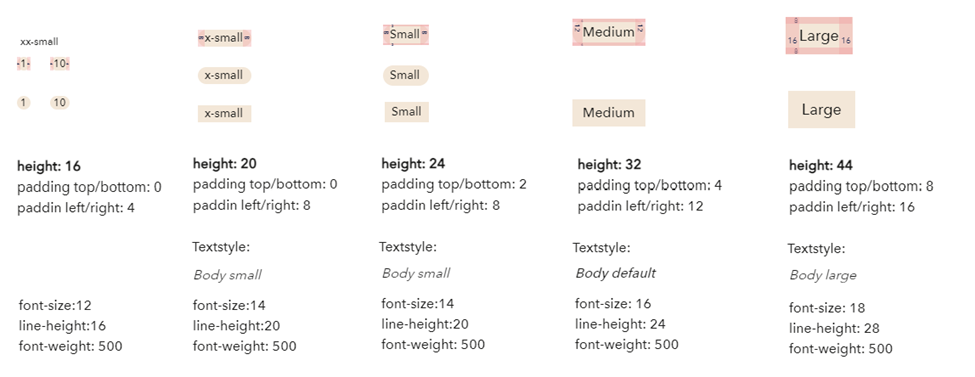
All of our components are available in the following sizes. Medium is our default.

Sizes for icons
Sizes for the icons are different to the other components, these are the specifications:
![]()
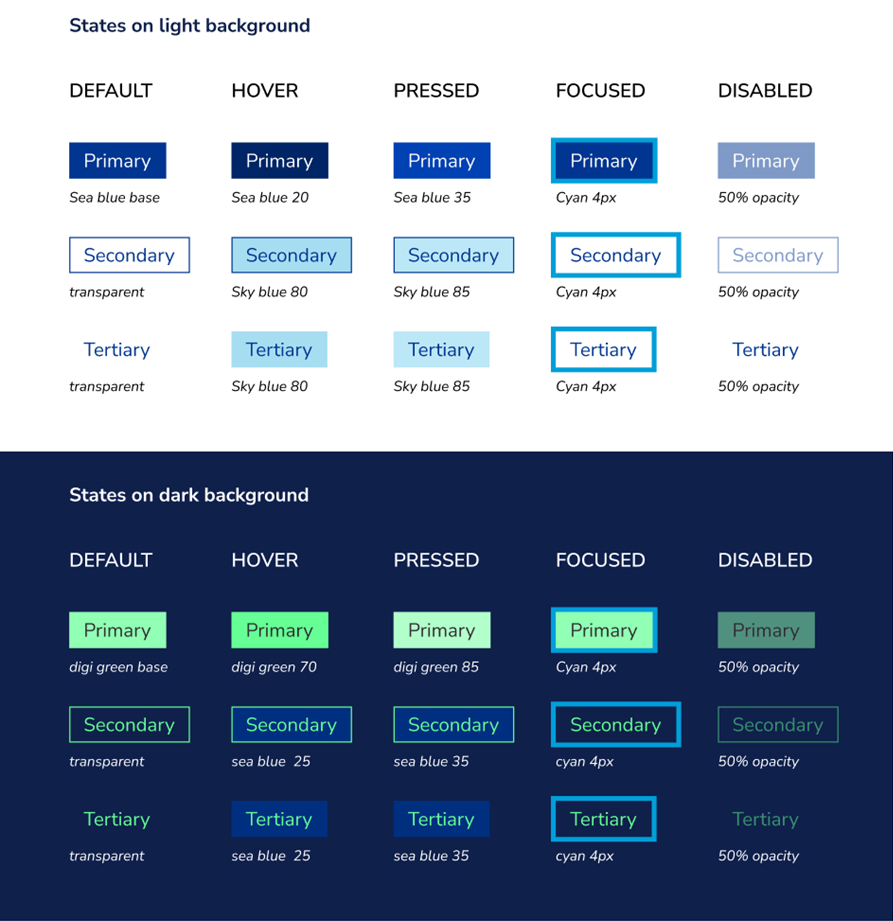
Component states
