Mobile Design
In 2022 in Digital Solutions within https://dnv.com 29% of interactions were on a mobile platform, 69% on a desktop with 1% on a tablet. Currently, several product lines are in the early stages of creating a dedicated app to support their digital services.
Mobile guidelines
These guidelines and principles can help you design a better experience for mobile, but they will not replace the need for going through the UX design process! Read more about the UX process in the Guidelines section.
General principles
When designing a mobile application, the functionalities, look and feel will be different from application to application based on the requirements and how complex it needs to be. However, some general principles should be followed. To read the complete list of principles with illustrations, visit the following link: https://www.smashingmagazine.com/2018/02/comprehensive-guide-to-mobile-app-design/.
Spacing is vital
Users are using their fat fingers. Good spacing between elements is, therefore, vital.
Display Large Text
Keep in mind the smaller size of the mobile screen and make your text larger so it can be easier to read and understand.
Consider Thumb Positioning
Design screen layout while researching thumb-friendly zones. Provide tapping controls at a place where users can easily tap them using their thumb.
Offer more default input
It is harder to enter information on mobile.
Keep consistent with the web
Use the same colour palette and navigation structure as the web application to maintain consistency.
Don't copy UI elements between platforms
Make new UI elements for each platform to better utilize the space and functions.
Screen Orientation
On mobile devices, orientation should be vertical. 94% of users use their smartphone vertically, while 6% do so horizontally, so designing for the vertical view is the right way to go.
Limit the length of text lines
A good rule of thumb is to use 30 to 40 characters per line for mobile.
Optimize Push Notifications
When users Start using your app, they won't mind getting notifications as long as the value they bring is sufficiently greater than the interruption. Almost 50% of users are grateful for notifications that interest them.
Communicate current location
Failing to indicate the current location is a widespread problem of many mobile app menus. "Where am I?" is one of the fundamental questions users need to answer in order to navigate successfully.
Make text readable
Generally, anything smaller than 16 pixels (or 11 points) is challenging to read on a mobile screen.
Help Center
Help should be easy to find. It is a more significant need on mobile.
Take advantage of the device's capabilities
Mobile devices have a lot of sensors the can be used to improve Me user experience. Here are just a few features that you can use to do that.
- Camera for data input
- Location awareness
- Biometric authentication
Questions to ask yourself before creating a mobile application:
- Which value does the app provide for the users and our business?
- Do you really need an app?
- How important is it for the end user?
- Will it significantly improve the user's workflow?
- Do you need a tablet version too?
- How is the user experience in your current application?
- Will the mobile user experience be significantly worse compared to the desktop version?
- How well do we expect the end user to adapt?
- Will it hurt our brand?
Click on the link to view a full list of considerations: https://digitalskillsglobal.com/blog/11-things-to-consider-before-you-design-and-build-your-app
Responsive vs. Adaptive Design
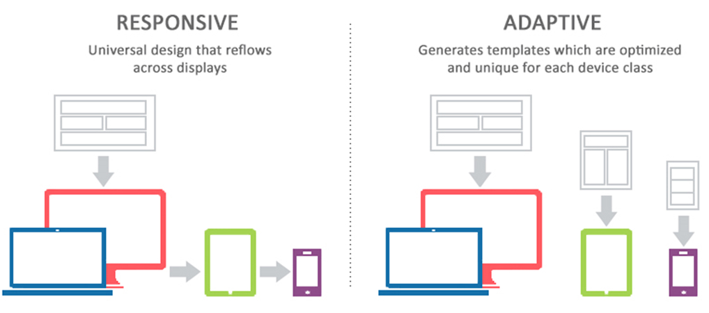
When designing for mobile, two approaches can be employed — responsive and adaptive design. The difference between the approaches spotlights important web and app development options for designers/developers. Therefore it is essential to understand the difference between the two.

Adaptive Design
In adaptive design, a different website layout is created for each device's screen. As it loads, the site recognizes the size of the screen and serves up the structure that was made for that viewport. You can create a different user experience for each of the six standard screen sizes from very small to very large: 320px, 480px, 760px, 960px, 1200px, and 1600px.
Read more: https://www.interaction-design.org/literature/topics/adaptive-design
Best used for: Online/desktop applications
Synergi Life
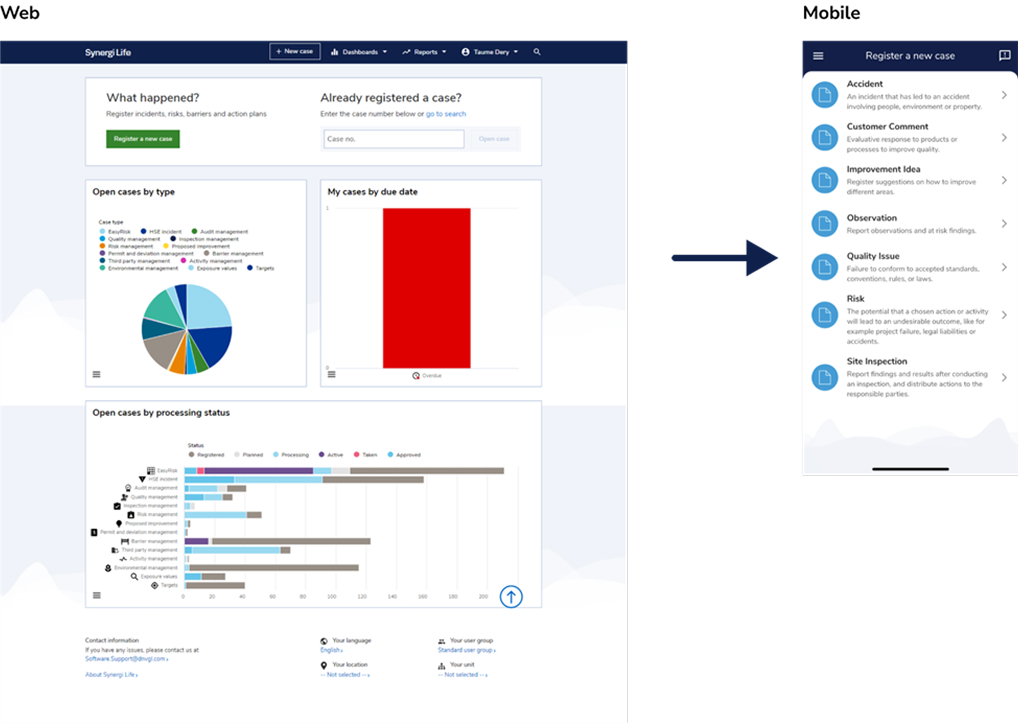
An example is Synergi Life, whereby the product line designed a tailor-made mobile application to assist their web service. The application is specifically made with a minimal approach to perform a specific set of tasks for a particular target audience compared to the web application with greater functionality.

Responsive Design
A website created with responsive design serves up the same site for every device, but the site is fluid and will change its layout and appearance based on the size and orientation of the device. Responsive design is straightforward. Because it is fluid, users can access your online world and enjoy as much on their handheld device as they would on a massive monitor.
Learn about the guidelines to consider when making a responsive design: https://polypane.app/blog/responsive-design-ground-rules/
Best used for: Web pages
My DNV Software
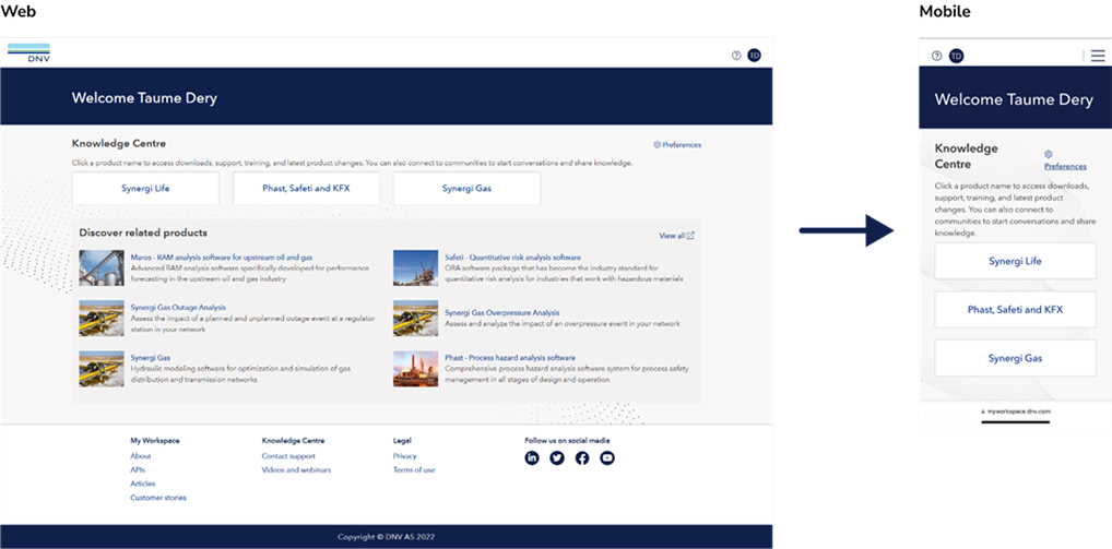
An example of this is the My DNV Software homepage. Since the design components are designed for a responsive design, elements like the header and menu adjust to fit the screen size regardless of the platform. A responsive design serves as a suitable solution if this is a non-complicated web page. However, a responsive design would be better for more complex web applications.

Desktop-to-mobile considerations
Specific guidelines must be considered when adopting an already existing digital service to a mobile application. Here is summary of some of the most important ones:
- Discard or simplify complicated data components like Tables, forms, and graphs. These are not suited for mobile.
- Simplify desktop functions that are hard to design for a mobile platform. Consider how vital are filters, alerts, sub-categories, etc..
- Reduce functionality to shorten the number of clicks it takes to complete a task.
- Prioritization of critical notifications as it can quickly become an irritation on mobile.
- Simplify the homepage only to include essential tasks.